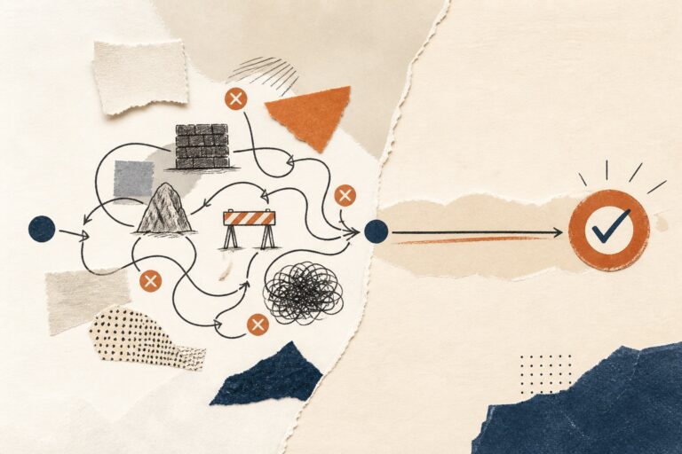
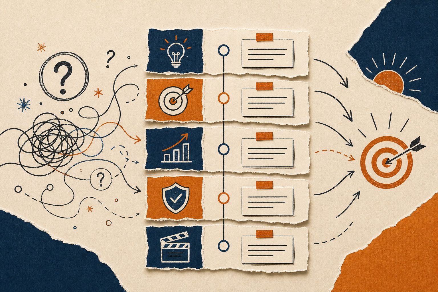
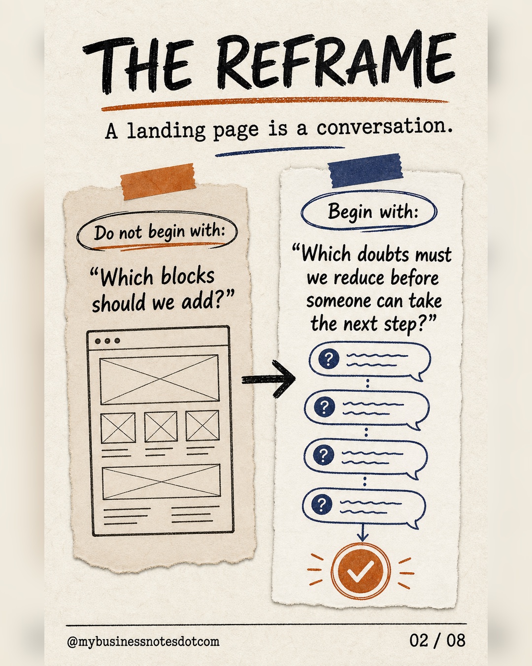
A landing page decision map organizes each section around one uncertainty it must reduce before a visitor can take the next step. Instead of assembling a standard stack of blocks, it turns the page into a deliberate conversation: explain the offer, establish relevance, make the value mechanism concrete, build justified confidence, and ask for a commitment that matches the confidence already earned.
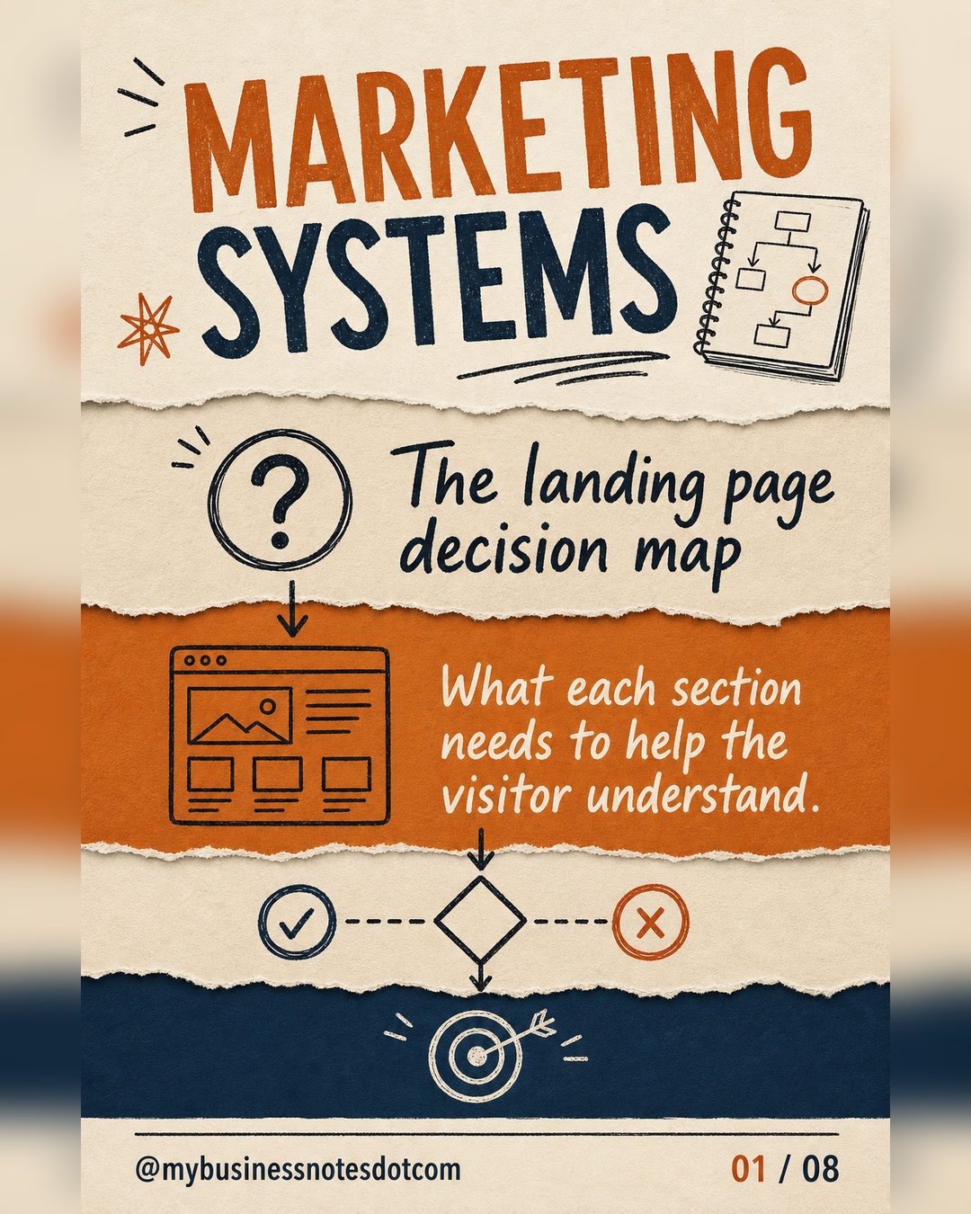
Slide 1 of 8
What is a landing page decision map?
A landing page decision map is a functional plan for the visitor’s decision journey. It defines what each section must help the visitor understand or believe before the page asks for action. This makes it different from a wireframe, which specifies layout, and from a block checklist, which merely lists elements such as a hero, testimonials, pricing, and FAQs.
The map starts with five questions: Does the visitor understand the offer? Do they recognize that it is relevant to their situation? Can they see how the proposed progress happens? Do they have enough reason to trust the claim? Is the requested next step reasonable at this point?
Why standard landing page checklists fall short
Common landing page guidance is useful because it names recurring ingredients: a clear value proposition, benefits, proof, and a focused call to action. Unbounce, for example, describes these as core elements of landing page anatomy. But an ingredient list cannot decide the order, depth, or evidence your specific buyer needs.
A testimonial may be valuable when the visitor doubts whether the outcome is achievable. It may be irrelevant when the real doubt is whether the service applies to a small company. A detailed process diagram may help with an unfamiliar consulting offer, yet add friction to a simple low-risk download. The right test is not “Does the page contain this block?” It is “Which uncertainty does this block reduce?”
The five jobs in the landing page decision map
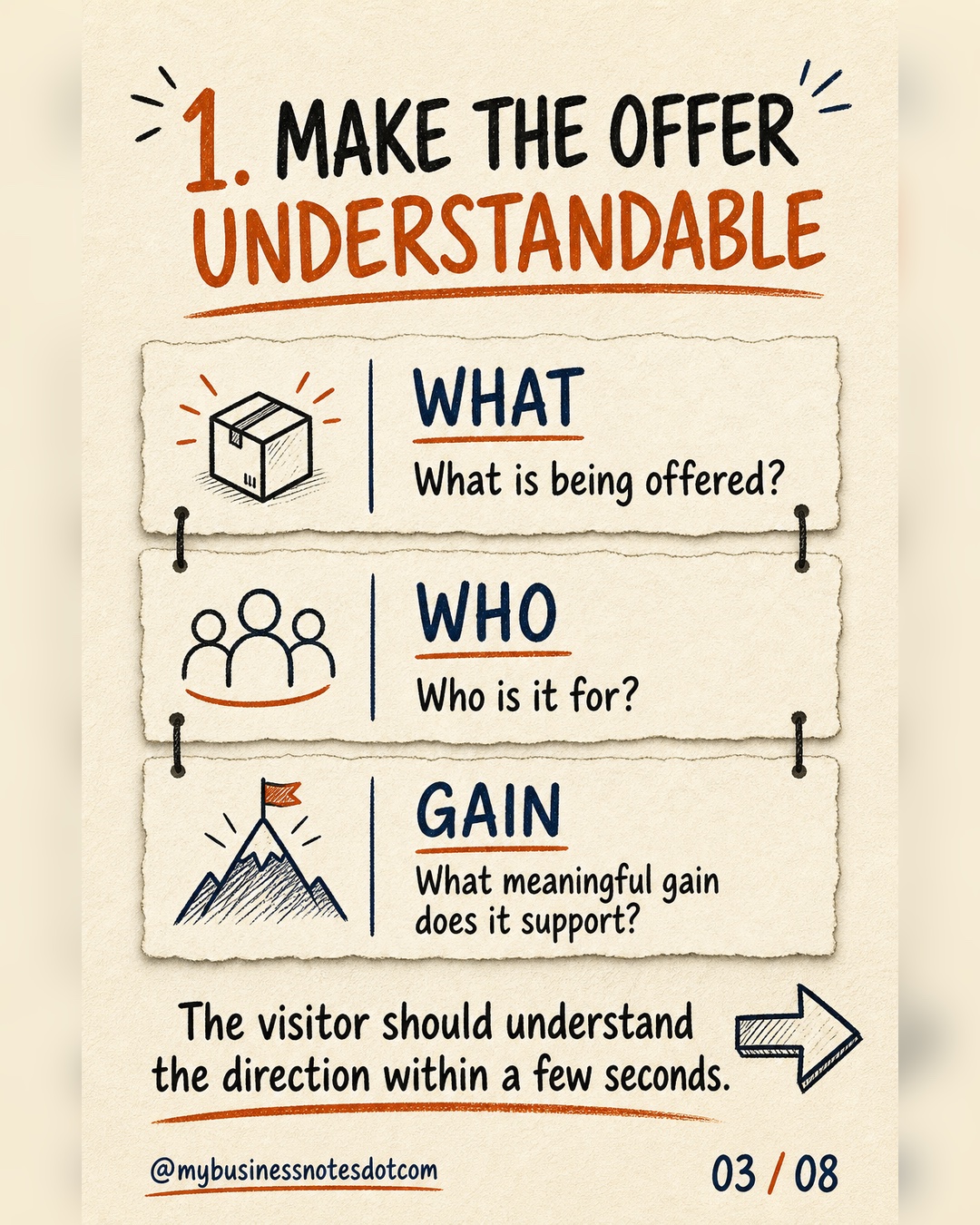
1. Make the offer understandable
The opening section should give a visitor a fast, concrete orientation. State what is being offered, who it is for, and what meaningful gain it supports. Clarity is more valuable here than cleverness. A headline that sounds distinctive but hides the offer forces the visitor to spend attention decoding the page before they can evaluate it.
Check the first screen by asking a person outside the project to look at it briefly and answer three questions: What is this? Is it meant for someone like me? What could improve if I continue? If those answers are fuzzy, later persuasion is standing on an unstable foundation.
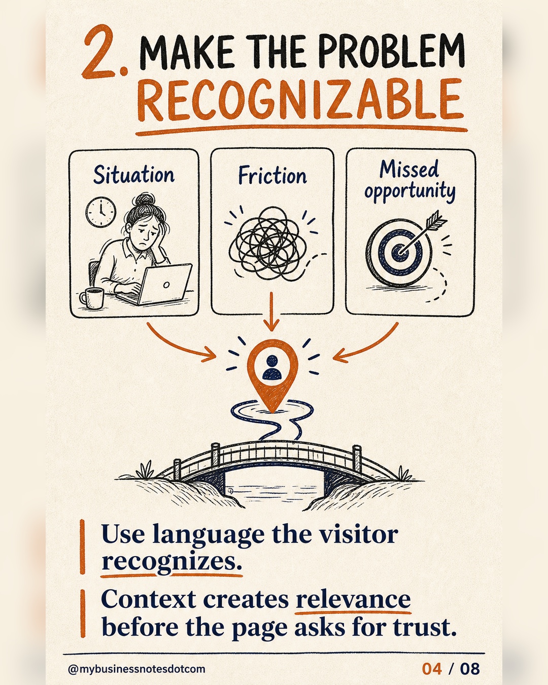
2. Make the problem recognizable
Once the direction is clear, connect it to the visitor’s world. Describe the situation, friction, or missed opportunity in language the audience would naturally use. Recognition creates relevance: it shows that the offer is not only understandable in general, but pertinent to this decision.
Specificity matters. “Grow your business” is broad enough to fit almost anything. “Turn qualified website visits into booked diagnostic calls without adding another sales tool” identifies a context, desired change, and constraint. The purpose is not to intensify pain artificially; it is to demonstrate an accurate understanding of the starting point.
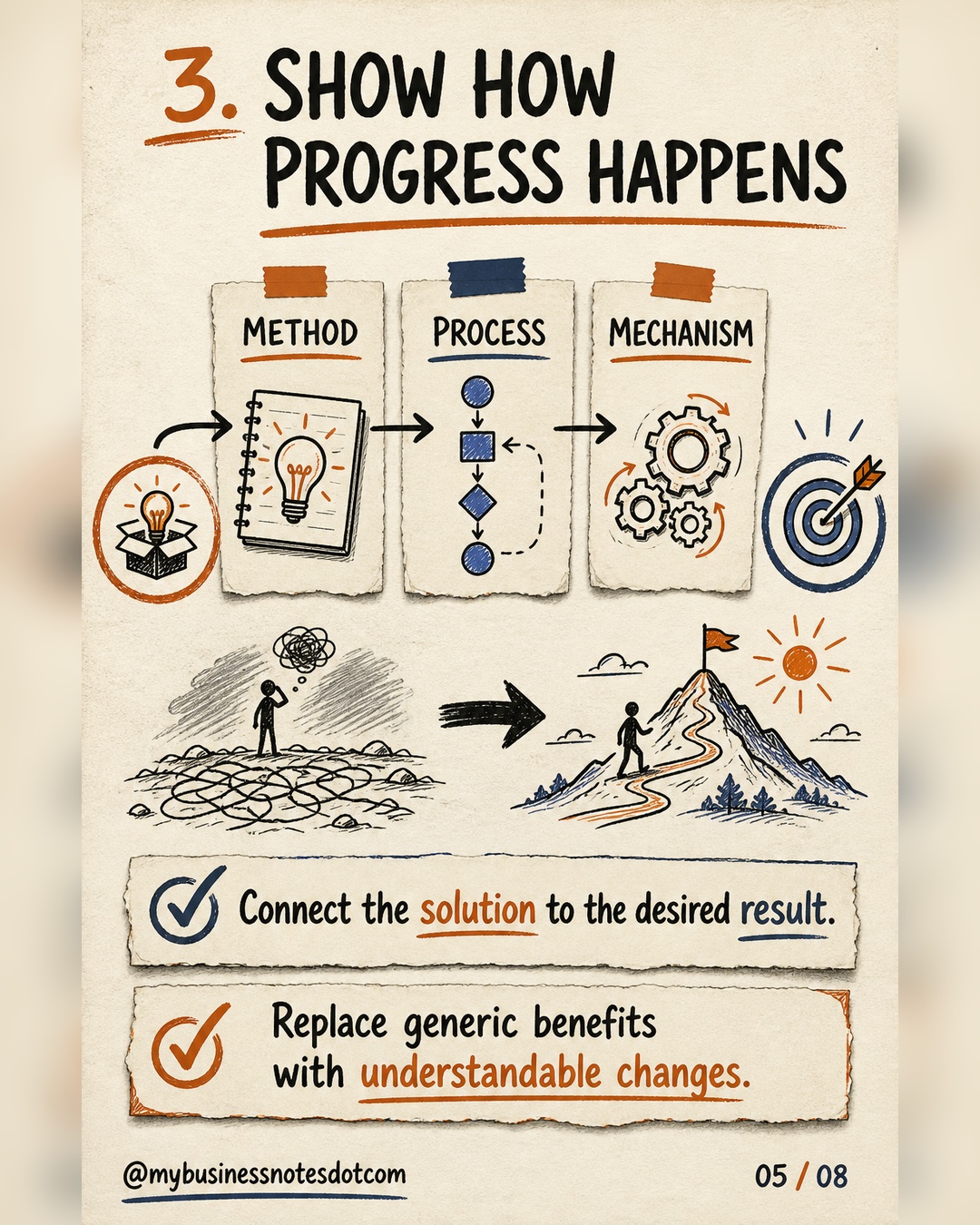
3. Show how progress happens
A benefit describes the destination. The mechanism makes the route believable. Explain the method, sequence, capability, or operating change that connects the offer to the desired result. This is especially important for services and complex products, where a promise alone leaves the buyer wondering what they are actually purchasing.
Translate features into observable changes without erasing the features. A dashboard is not valuable merely because it exists; it may be valuable because it brings acquisition, conversion, and revenue signals into one weekly decision view. Strong landing pages connect the capability, the change it enables, and the outcome it supports.
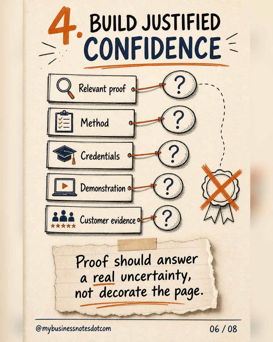
4. Build justified confidence
Proof is useful only when it answers a doubt. Match the evidence to the claim: a relevant case study can support outcome credibility; a live demonstration can reduce product uncertainty; credentials can support expertise; a transparent method can reduce execution risk; a guarantee can reduce financial risk.
Generic logo walls and vague testimonials often decorate a page without strengthening the decision. Prefer evidence with context: who the customer was, what situation they faced, what changed, and how the offer contributed. Never let social proof imply certainty that the evidence cannot support.
5. Ask for the right commitment
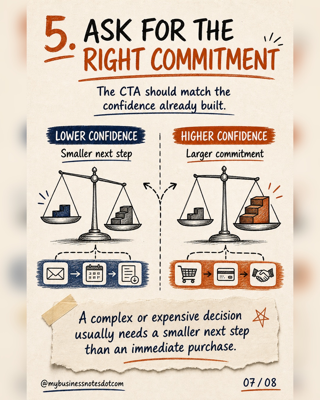
The call to action should be clear, specific, and proportional to the confidence built on the page. A low-risk resource can reasonably ask for an immediate download. A costly or consequential service may need a smaller next step, such as checking fit, requesting an assessment, or booking a short conversation.
This does not mean a page must have only one button. It means repeated buttons should support one coherent conversion goal. The visitor should know what happens after clicking, what effort is required, and whether the action is the sensible next step.
A functional map, not a fixed formula
The five jobs describe a decision sequence, not five mandatory screen-sized sections. One section may perform two jobs. A complex offer may need several sections to build confidence. Visitors arriving from a detailed webinar may already understand the problem, while visitors arriving from a broad search may need more context.
Video, pricing, testimonials, comparison tables, long-form copy, and FAQs are therefore contextual tools. Include them when they reduce an important uncertainty more effectively than the alternatives. Remove them when they compete with the page’s purpose or repeat information without advancing the decision.
How to audit a landing page section by section
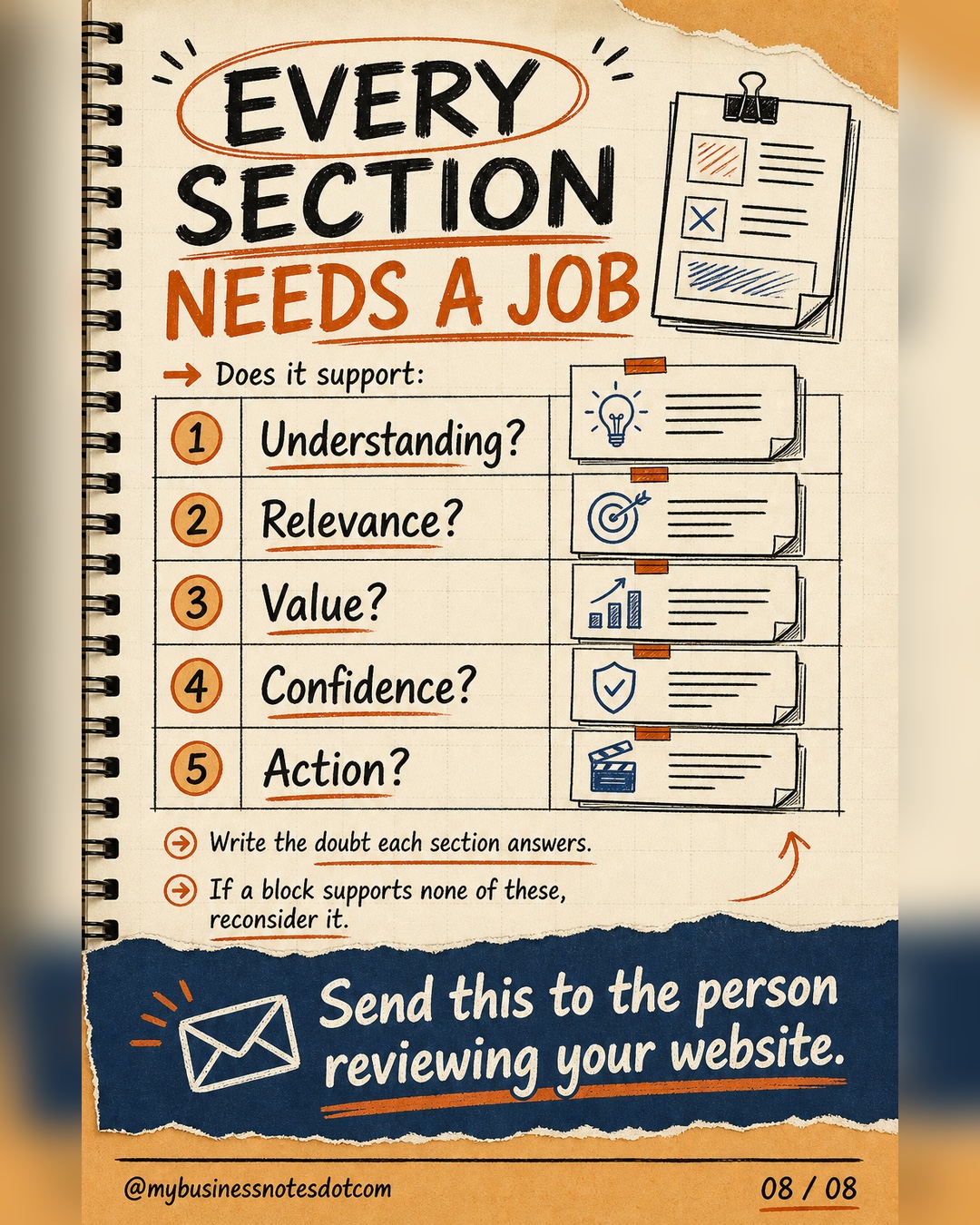
Review the page in sequence and complete the following map. If the team cannot identify a section’s job, that section is a candidate for rewriting, combining, moving, or removing.
| Audit question | What to record |
|---|---|
| Which doubt appears here? | Write the visitor’s question in plain language. |
| Which job should this section perform? | Understanding, relevance, value, confidence, or action. |
| What claim are we making? | State one precise idea the visitor should take away. |
| What evidence or explanation supports it? | Use the most direct credible support available. |
| What should become easier next? | Define the next question, section, or action. |
Run the audit with people from marketing, sales, delivery, and customer success when possible. Each team sees different recurring uncertainties. Then validate the resulting hypotheses with customer language, usability observation, analytics, and controlled tests. The map improves the quality of what you test; it does not replace testing.
Common mapping mistakes
- Starting with a preferred layout: the template begins to dictate the argument.
- Repeating benefits without a mechanism: the page promises progress but never explains why it is plausible.
- Using proof without relevance: impressive evidence answers a question the visitor is not asking.
- Asking for too much too soon: the CTA requires more trust, time, or risk than the page has justified.
- Treating length as the goal: a page should be as long as the decision requires and as concise as clarity permits.
Frequently asked questions
Which sections are required on a landing page?
No universal set of visual sections fits every offer. Most pages must communicate the offer, its value, credible support, and a next action, but those functions may be combined or expanded according to audience awareness, risk, price, and complexity.
What is the ideal landing page length?
There is no evidence-based length that is ideal for every landing page. Use enough information to resolve the important uncertainties without adding repetition or distraction, then test the page with its actual traffic and conversion goal.
Does every landing page need testimonials?
No. Testimonials are one form of proof. Use them when authentic customer experience answers a material doubt. A demonstration, case study, credential, transparent method, or product data may be more relevant in another decision.
Should a landing page show pricing?
Show pricing when it helps visitors assess fit and the offer can be understood without extensive diagnosis. For configurable or complex services, a range, starting point, or explanation of pricing factors may reduce uncertainty more honestly than a single figure.
How many calls to action should a landing page have?
A landing page should have one primary conversion goal, although the corresponding CTA may appear more than once. Secondary actions should exist only when they support the same decision journey rather than compete with it.
Turn the page into a decision conversation
A strong landing page does not win by collecting more blocks. It helps a specific visitor move from uncertainty to an appropriate action. Give every section a job, connect every claim to relevant support, and make every CTA proportional to the confidence the page has earned.
Download the landing page decision map
Keep the complete eight-slide framework as a PDF and use it in your next website review.
International references